
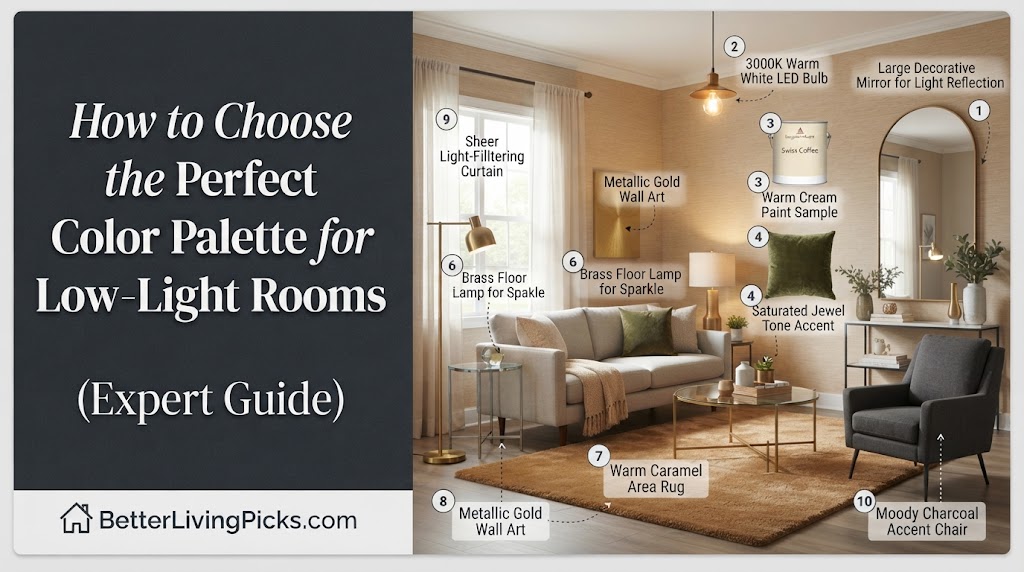
Pure white paint lacks the pigment depth needed to absorb and reflect weak natural light. Without direct sunshine, it picks up ambient shadows and turns a stark, lifeless gray or cold blue.
2. What are the best paint colors for low-light north-facing rooms?
Warm neutrals with heavy yellow, red, or peach undertones—such as creamy off-whites, warm taupes, and soft terracottas—counterbalance the inherently cool, bluish light of north-facing windows.
3. Should I paint a dark room a dark color?
Yes, embracing the cave effect with saturated jewel tones, deep charcoals, or rich forest greens creates an intentional, incredibly cozy, and sophisticated atmosphere instead of looking muddy.
4. How do paint finishes affect brightness in dim spaces?
Choosing an eggshell or satin finish adds a subtle, diffuse sheen that gently bounces artificial light around the room without creating distracting, glossy plastic glares on uneven drywall.
Walking into a room with zero direct sunlight can feel entirely defeating, especially after spending hours scrolling through bright, sun-drenched design blogs. Most people instinctively grab the purest, brightest white paint off the shelf, hoping to artificially inflate the light levels, only to end up with a space that feels cold, sterile, and strangely blue-tinted.
Getting a low-light room to look incredible isn’t about fighting the architecture or pretending the sun is shining where it isn’t. It is about understanding how low-lumen spaces react to pigments, leveraging warm undertones, and sometimes leaning completely into the cozy, intimate shadows rather than running away from them.
Understanding Why Low-Light Rooms Feel Gloomy (And Why White Paint Often Fails)

We have all done it. You move into a house, step into a bedroom with a tiny window facing a brick wall, and immediately declare, “We need to paint this white to brighten it up.” Six gallons of ultra-bright white paint later, the room looks like an institutional hallway.
The primary reason this happens comes down to physics and pigment formulation. Paint does not generate light; it only reflects whatever light hits its surface. When a room lacks natural illumination, white paint simply has nothing to bounce back. Instead, it reveals every cold shadow, making the space feel stark, clinical, and remarkably dingy.
The Science of Natural Light Direction (North vs. South vs. East vs. West)
Before selecting any color swatch, you must look at which direction your windows face. This single factor changes how every color behaves throughout the day. North-facing rooms receive cool, indirect, and bluish light all day long. If you put a cool-toned gray or a stark white in a north-facing room, you are doubling down on that chill.
South-facing rooms receive warm, bright light throughout the day, making them forgiving environments for almost any color palette. East-facing rooms get bright, warm morning light followed by cool, flat afternoon shadows. West-facing rooms start dull and cold in the morning, then explode with a warm, golden-hour blast late in the day. Knowing your orientation prevents you from picking a color that looks great in a paint store but awful in your specific room.
The Myth of the “Brightening” Pure White Paint
Pure white and ultra-pale pastel paints rely entirely on high LRV (Light Reflectance Value) ratings. Manufacturers market an LRV of 85 or higher as the ultimate fix for dark rooms. In reality, these shades require an abundance of raw photons to activate their brightness potential.
In a low-light room, high-LRV paints fall flat because there simply aren’t enough photons to bounce around. They look murky, grayed-out, and uninspiring. Instead of reaching for a sterile white, look for rich, complex neutrals with high pigment density that know how to handle shadows gracefully.
Embracing the Darkness: Choosing Rich, Moody, and Cohesive Palettes
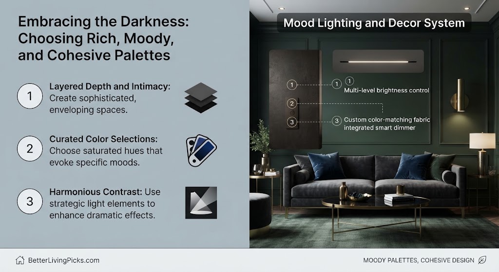
Fighting against the natural architectural limitations of your home is an uphill battle. When a room gets very little light, trying to make it feel like a sunlit greenhouse usually ends in disappointment. Instead, many interior designers choose to lean entirely into the shadows.
By selecting deep, saturated tones, you eliminate the awkward transition zone where light fades into muddy gray shadows. The room stops trying to be bright and instead becomes an intentional, dramatic sanctuary.
Leaning into the Cave Effect for Cozy Spaces
The cave effect happens when you paint a dim room a deep, enveloping color like charcoal gray, midnight navy, or dark olive green. Rather than feeling small or claustrophobic, the walls seem to recede into the shadows, blurring the boundaries of the room.
This design strategy works brilliantly for media rooms, home offices, and bedrooms where you want to feel tucked away from the chaos of the world. Because the room is naturally dark, these rich colors look soft and velvety rather than harsh or oppressive.
Saturated Jewel Tones That Glow Under Artificial Light
Jewel tones like emerald green, sapphire blue, ruby red, and rich plum thrive in low-light environments. These colors contain complex, heavy pigmentation that responds exceptionally well to warm artificial lighting like incandescent or warm LED bulbs.
When evening rolls on and lamps are switched on, jewel tones catch the amber glow and emit a rich, luminous sheen. They don’t look dark and dead; they look alive, deep, and deeply comforting.
Warming Up Cool Spaces: The Power of Undertones
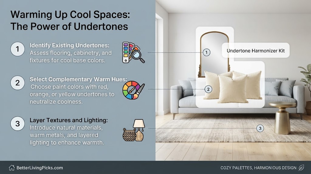
If moody, dark walls aren’t your style and you prefer a traditional, light-feeling space, your secret weapon is understanding paint undertones. Every single paint color on a swatch card has a hidden undertone lurking beneath the surface.
In low-light rooms, cool undertones like blue, green, and violet will immediately come forward and dominate the space. To prevent this, you must seek out colors fortified with warm undertones.
Identifying Hidden Green and Gray Undertones in Neutral Paints
Choosing a neutral paint seems straightforward until you tape it to your wall and realize your nice beige paint has turned an aggressive shade of Pepto-Bismol pink or mint green. This happens because low-light rooms strip away balanced lighting and expose hidden secondary pigments.
Always check a paint chip against a pure white sheet of paper. This contrast forces the hidden undertones to reveal themselves. If your greige (gray-beige) sample looks even slightly green on paper, it will look fully sage green in a dark room.
Creamy, warm off-whites with heavy golden-yellow or amber bases—such as Swiss Coffee by Benjamin Moore or Alabaster by Sherwin-Williams—provide the ultimate balance of warmth and light reflection without looking yellow or dingy.
Choosing Creams, Warm Beiges, and Soft Terracottas
When you want a bright, airy feel in a dim room, bypass standard grays and cool whites completely. Focus instead on warm creams, butter-toned ivories, and soft earthy terracottas.
These hues inject artificial warmth into the room, mimicking the psychological feeling of sunlight. Even on an overcast day, a terracotta-toned guest room or a creamy living room feels inviting, cozy, and wrapped in sunlight.
Maximizing Reflection Without Glossy Glare
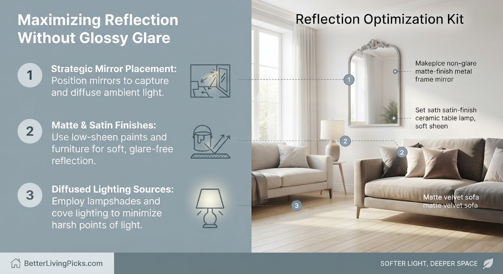
Once you have selected your ideal pigment palette, the next crucial step is determining how the paint finish interacts with light. Finish selection dictates how much light bounces off your walls and how much gets absorbed.
Many homeowners mistakenly believe that high-gloss paint is the only way to brighten a dark room. Unfortunately, high-gloss paint highlights every single imperfection, patch, and dent in your drywall.
Strategic Finish Selection (Eggshell, Satin, and Matte Trade-offs)
For low-light living rooms and bedrooms, an eggshell or low-sheen satin finish provides the sweet spot. Eggshell offers a soft, velvety appearance with just enough reflection to bounce ambient light gently around the room without creating glaring reflections.
Matte paint absorbs light completely. While modern matte formulas are washable and durable, they can make a dark room feel flatter and heavier. Reserve true matte finishes for ceilings or for rooms where you explicitly want a deeply cocooning, light-absorbing atmosphere.
Using Metallic and High-Gloss Accents to Bounce Light
Instead of painting entire walls in high-gloss finishes, use metallic accents, mirrors, and glass decor elements to amplify light distribution. Placing a large mirror directly opposite a window or a primary light source instantly doubles the perceived light in a dim space.
Incorporate brushed brass, antique gold, or polished chrome light fixtures. These metallic surfaces catch stray beams from lamps and scatter warm highlights across the room, breaking up dark corners effortlessly.
Room-by-Room Low-Light Color Strategies
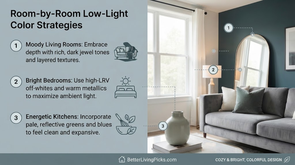
Every room in your house serves a different function, meaning your color strategy must adapt based on how and when you use the space. A north-facing kitchen has entirely different lighting challenges than a windowless powder room.
Let’s break down practical color palettes tailored specifically for the most common low-light zones in residential homes.
Transforming North-Facing Living Rooms and Dens
North-facing living rooms often feel chilly and uninviting during winter afternoons. To counteract this, build your color palette around warm, saturated mid-tones.
- Option 1: Rich mustard or camel tones that mimic golden sunlight.
- Option 2: Muted olive greens paired with warm cream trim.
- Option 3: Deep dusty pinks or warm terracottas that add an immediate flush of color and warmth.
Creating Intimate, Moody Low-Light Bedrooms
Bedrooms are the one space in a home where low light is actually an advantage. You want your bedroom to feel restful, quiet, and secure, making it the perfect candidate for deep, moody hues.
Wrap the room in inky indigo, deep plum, or charcoal. Pair these walls with heavy textured linens, warm wood tones, and layered lighting to build a five-star hotel suite experience right at home.
Brightening Basement Spaces Without Windows
Basements with zero windows present the ultimate color challenge. Without a single natural light source, relying on paint alone to brighten the space is impossible.
Instead of fighting the darkness with harsh white paint that looks gray, choose a rich, warm taupe or a soft caramel beige. Combine this wall color with layered, color-corrected LED lighting to make the windowless room feel like an intentional subterranean lounge.
Common Painting Mistakes to Avoid in Dark Rooms
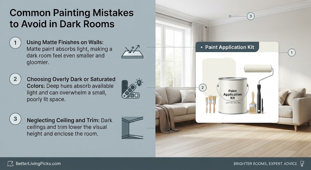
Choosing the right color is only half the battle. Many DIY decorators stumble during the testing and lighting phases, leading to expensive repainting projects.
Avoiding these common pitfalls will save you time, money, and frustration when tackling your low-light room makeover.
Skipping the Large-Scale Peel-and-Stick Sample Test
Never paint a tiny 2-inch square of color directly onto your existing wall color and judge it. The surrounding old paint color will completely skew your perception of the new sample.
Instead, paint large sample boards or use large peel-and-stick paint samples. Move them around from wall to wall—checking corners, walls opposite windows, and shadowed alcoves—to see how the color shifts throughout the day.
Ignoring the Color Temperature of Your Light Bulbs
You can pick the absolute best warm cream paint on the market, but if you screw in a harsh 5000K daylight LED bulb, your room will instantly look like a dentist’s office. Light bulb color temperature dictates everything in a low-light room.
Stick strictly to bulbs rated between 2700K and 3000K (warm white to soft white). This color temperature pumps golden, cozy tones into your space, activating the warm undertones in your paint and making the entire room feel inviting.
- Avoid pure white paint: Without direct sunlight, high-LRV whites look dingy, cold, and gray instead of bright and airy.
- Analyze window orientation: North and east windows require warm undertones, while south and west windows handle cool colors much better.
- Embrace moody pigments: Lean into the cave effect with saturated jewel tones or deep charcoals to create an intentional, cozy sanctuary.
- Match your light bulbs: Always use 2700K to 3000K warm LED bulbs to activate your paint’s warm undertones and prevent a clinical look.
Frequently Asked Questions
Does painting a dark room a light color actually make it brighter?
Not necessarily. If a room has very little natural sunlight, high-LRV light paint lacks the photons required to reflect brightness. It often ends up looking murky, gray, and lifeless rather than bright and sunny.
What are the best paint colors for a north-facing room?
Warm creams, buttery off-whites, taupes, and soft terracottas work best. These colors actively counterbalance the cool, bluish natural light that enters north-facing windows all day long.
Should I use matte or satin paint in a dark room?
An eggshell or low-sheen satin finish is ideal. It provides a subtle sheen that gently bounces ambient artificial light around the space without highlighting every minor flaw on your drywall like high-gloss paint does.
Can I use gray paint in a room with low light?
You can use gray, but you must choose a greige (gray-beige) with strong warm undertones. Pure cool grays will turn stark, cold, and depressing in a room lacking direct sunlight.
How do light bulbs affect my wall color in dim rooms?
Light bulbs dictate the color output of your space. Using harsh, cool daylight bulbs (5000K) in a dark room makes warm paint colors look muddy. Stick to 2700K to 3000K warm white bulbs for a cozy glow.
What is the cave effect and should I use it?
The cave effect is when you paint a dim room a deep, saturated color like navy, forest green, or charcoal. It makes the walls recede into shadows, creating an intentional, cozy, and sophisticated atmosphere instead of fighting the natural darkness.
How can I test paint samples correctly in a dark room?
Paint large sample boards with a two-inch unpainted white border around the edges. Move these boards to different walls throughout the day to see how morning, afternoon, and evening artificial lighting alters the undertones.
Are dark colors harder to paint over later?
Yes, deep saturated pigments and dark bases require multiple coats of high-hiding primer before you can paint over them with a lighter color. Always factor in an extra coat of tinted primer if you plan to change colors down the road.
Do mirrors help brighten a low-light room?
Mirrors are fantastic tools for bouncing light. Placing a large mirror opposite a window or a prominent lamp multiplies the perceived light distribution and opens up tight, dim spaces.
What accent colors look best with warm neutral walls in dark spaces?
Earth tones like rust, mustard yellow, warm terracotta, and deep forest green complement warm neutral walls beautifully, adding rich layers and visual depth to cozy spaces.
Can I paint my ceiling the same color as the walls?
Yes, color-drenching the ceiling and walls in the same dark or mid-tone shade eliminates harsh contrast lines, blurs the room’s boundaries, and enhances the cozy cocoon effect.
Transforming Your Dim Spaces With Confidence
Choosing colors for low-light rooms stops being intimidating once you stop fighting your architecture and start working with it. Whether you decide to wrap your walls in a moody, enveloping jewel tone or warm up the space with buttery creams and amber undertones, the secret lies in intentional choices and proper sample testing. Grab your sample boards, check your light bulb temperatures, and turn your home’s darkest corners into your favorite rooms in the house.

